Search Results
35 items found for ""
- The Laws of UX
This is a video about The Laws of UX which explains about 19 Psychological Design Principles, by Product Designer Jon Yablonski. Jon Yablonski recently created an incredible website outlining the maxims principles that designers can consider when building user interfaces. It’s called Laws of UX and Jon was kind enough to give me permission to bring these principles to you in this video. Over the next few minutes, you’ll learn the names of 19 principles, along with their origins and how to apply them. Video length is 10 minutes and 03 seconds. . Happy Watching! Quick Markers 00:23 - 01 Aesthetic Usability Effect 00:50 - 02 Doherty Threshold 01:25 - 03 Fitts’ Law 02:02 - 04 Hick’s Law 02:39 - 05 Jakob’s Law 03:07 - 06 Law of Common Region 03:40 - 07 Law of Prägnanz 04:21 - 08 Law of Proximity 04:38 - 09 Law of Similarity 05:00 - 10 Law of Uniform Connectedness 05:20 - 11 Miller’s Law 05:45 - 12 Occam’s Razor 06:04 - 13 Pareto Principle 06:38 - 14 Parkinson’s Law 07:02 - 15 Postel’s Law 07:29 - 16 Serial Position Effect 08:04 - 17 Tesler’s Law 08:42 - 18 Von Restorff Effect 09:13 - 19 Zeigarnik Effect Get the latest user experience news & articles. Subscribe with us
- The Immutable Rules of UX
This is a video about The Immutable Rules of UX, by NNgroup. Jakob Nielsen's keynote at the Las Vegas UX Conference discussed the foundational principles of user experience that are stable decade after decade. Video length is 39 minutes and 08 seconds. Happy Watching! Get the latest user experience news & articles. Subscribe with us
- Nudge: Improving decisions about health, wealth, and happiness
This is a book review for Nudge, by Richard H Thaler and Cass R Sunstein. A must read book for people who want me choice architects. Every day we’re constantly faced with choices—what to order at a restaurant, what clothes to buy at a store, what show to stream when we get home from work. We’re so used to making choices that we are not even aware of the way those choices are presented. If grocery stores didn’t stock candy at the register, would we eat less of it? If we had to “opt out” of being organ donors rather than “opt in,” would the organ donor pool grow? In Nudge, Nobel Prize–winning economist Richard Thaler and renowned legal scholar Cass Sunstein examine how certain choice structures—“architectures,” in their terms—can “nudge” us toward better decisions. You’ll learn how flesh-and-blood humans differ from the humans studied in economics, why people are so bad at saving, and how to revitalize the institution of marriage (hint: abolish it). Happy Reading! This book review has been originally published in: Short Form Book link: https://www.shortform.com/app/books?search=nudge Buy any different versions of these books on Amazon India: Get the latest user experience news & articles. Subscribe with us
- Start With Why: How Great Leaders Inspire Everyone To Take Action
This is a book review for Start with Why, by Simon Sinek. Although there are thousands of successful companies and leaders, only a few ever really change the world. What makes these different from the rest? They start with WHY - the vision and mission behind their efforts. Starting with WHY yields benefits like a more inspired team, more loyal customers, and enduring long-term success. In Start With Why, learn how to discover your WHY and communicate it through your organization and to the outside world. Happy Reading! This book review has been originally published in: Good Reads Book link: https://www.shortform.com/summary/start-with-why-summary-simon-sinek?utm_source=google&utm_medium=cpc&gclid=Cj0KCQjwk4yGBhDQARIsACGfAeuhFyHgQIVWbw62Zo9QZA7sWmnIC6d19auDXBkzvlKo8i2IfHcm7bgaAiuwEALw_wcB Buy this book on now on Amazon India Get the latest user experience news & articles. Subscribe with us
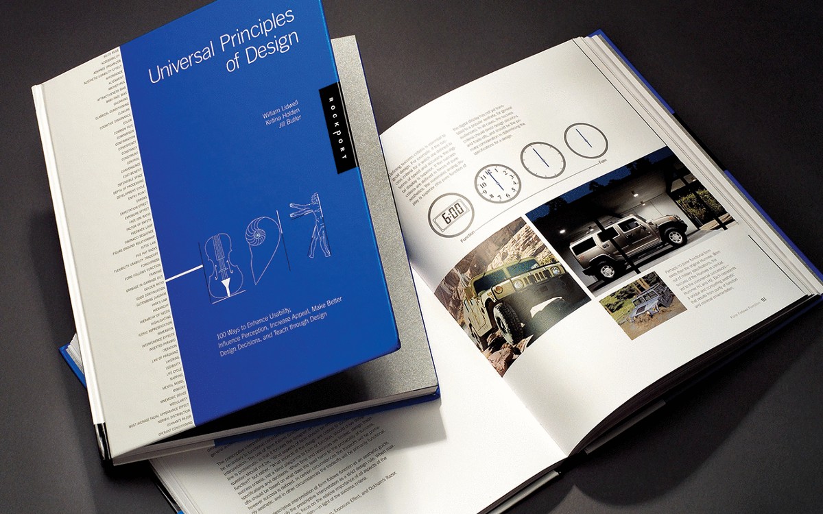
- Universal Principles of Design
This is a book review for Universal Principles of Design, by William Lidwell, Kritina Holden and Jill Butler. Whether a marketing campaign or a museum exhibit, a video game or a complex control system, the design we see is the culmination of many concepts and practices brought together from a variety of disciplines. Because no one can be an expert on everything, designers have always had to scramble to find the information and know-how required to make a design work - until now. Universal Principles of Design is the first cross-disciplinary reference of design. Richly illustrated and easy to navigate, this book pairs clear explanations of the design concepts featured with visual examples of those concepts applied in practice. From the 80/20 rule to chunking, from baby-face bias to Ockham's razor, and from self-similarity to storytelling, 100 design concepts are defined and illustrated for readers to expand their knowledge. This landmark reference will become the standard for designers, engineers, architects, and students who seek to broaden and improve their design expertise. Happy Reading! This book review has been originally published in: Good Reads Book link: https://www.goodreads.com/book/show/130730.Universal_Principles_of_Design Buy this book on now on Amazon India Get the latest user experience news & articles. Subscribe with us
- Designing for healthcare and post-pandemic
In this article, I have shared some of my experience working in the healthcare domain and the role of user experience in the healthcare domain for crafting a better experience. It also covers the topic of conducting user research activities in the post-pandemic world. You have an amazing experience of crafting design solutions for various domains, how the healthcare domain is different from all when it comes to user experience design? I’m fortunate to have an opportunity to work in various domains from retail, banking, insurance, to travel throughout my career. I have been working as a Design Manager crafting experiences in the area of education in healthcare. It has been the most exciting and challenging experience while working for the medical and healthcare domain. Designing for healthcare can be different from other domains as the design solutions provided could directly or indirectly impact the lives of the people around us. The World Health Organisation (WHO) (6) has estimated that nearly 138 million patients witness harm caused by medical errors every year, in medium and low economic status countries (including India) (WHO, Medication Without Harm). A Harvard study by Prof Jha (7) says that 5.2 million medical errors are happening in India annually. Similarly, the British Medical Journal quoted that India like any other developing country is recording a lot of medical errors. It becomes very important for the user experience practitioners to take up the initiative of understanding the healthcare domain, identify the critical problems through rigorous user experience research, and carefully craft the best solutions to match the end-users mental model. What is the role of user experience in the healthcare domain for crafting a better experience? A major shift that has been noted in the area of healthcare from a process-centric to a patient-centric approach. The user-centered design approach has been seen as the future of healthcare. Empathy will play a key role in closely relating to healthcare professionals and connecting with patients while designing the best experiences. There is a huge opportunity for designers to design an ecosystem of care. The designers have to take into consideration a few points while crafting the best experiences. Design for clarity, efficiency, and effectiveness Beyond any respective domains, a designer should always take into consideration the various facets of the user experience like useful, usable, desirable, valuable, findable, accessible, and credible. When it comes to designing for healthcare there are few of these facets that could weigh more than others. Bansi Mehta (1) has wonderfully explained that a UX designer must keep that in mind, especially in healthcare, the design needs to work like a scalpel and not like a Swiss knife, i.e. the design needs to be simple and intuitive and not distracting. The UX designer must resist the urge to over-design. The design should not overburden the healthcare professionals with the cognitive load which may cause someone to commit grave mistakes. The applications at its core should adhere to a few factors like being usable, findable, and accessible while other facets could support based on the context of use within healthcare. The situation in which healthcare professionals work could be quite intense and stressful and they need the technology to assist them in their work. The designs should be simple, easy to use, assist efficient decision making, and effectively fulfil the most critical goals of the users. Published: For the full article please click on below link: Published in Medium at Design Impacts. https://medium.com/kishansalian/designing-for-healthcare-and-post-pandemic-dd99068c7451 This is an article that has been published as a part of at First Edition — UXness magazine on 25 July 2020. You can download the magazine here at Edition 1, ‘Usability Testing’ — https://lnkd.in/eMJpz7D Get the latest user experience news & articles. Subscribe with us
- How do you judge UX maturity of any organization?
A quick technique to analyze the UX acceptance level in an organization during initial interviews and conversations. Introduction: You could be a fresher or an experienced user experience practitioner looking for an ideal company to work and leverage your career. There are several things that a person considers before deciding to join a company. One of those points could be preparing for the interview and acing it. You would have come across several articles concerning the list of questions that provide the best user experience questions and suggestions towards preparing your responses. The objective of this article is a little different. This article aims to prepare you to analyze the maturity level of user experience in a company during your initial interview process and more importantly during the initial round of discussions. It is an attempt to guide any UX practitioner on taking a crucial decision. A decision in your career to accept the right offer and not to land in the wrong organization. Most of the interview process would begin with one of the recruitment team members contacting for basic details and matching your skills and profile with their job descriptions. As a design lead and manager, I have faced the issue of not receiving correct candidate profiles while recruiting user experience designers. It could be lack of experience of recruitment team in the field of user experience to understand the overall demand. It is our responsibility to assist them in selecting potential candidates like providing questionnaire, joining them in few shortlisting sessions and giving continuous constructive feedback. After an initial discussion with the recruitment team, a phone interview is scheduled with a small group of interviewers. This is one of the best moments for a job aspirant to gauge the maturity of user experience in any organization. There are few rounds of questions asked to the candidate to qualify for another round of interview process. These interview questions and statements during the discussions are the early indicators that could be categorized into the best and worst categories. It would be nice, to begin with, some of the worst questions and statements followed by the best. This could provide a better picture of understanding the overall maturity of user experience in an organization. Worst questions and statements: 1. Show us your design portfolio (***UI Design!!!) What interview panel means: When this question comes too early in the interview process and the interviewer is interested in looking into the output and final designs rather than striking a conversation. It means the maturity level of user experience (acceptance and adoption) within an organization seems to be lowest. This could be one of those frequently asked “Dark Ages” questions to any user experience practitioner. 2. Do you just create sketches and wireframes? that’s all? (***Cost-effective resources !!!) What interview panel means: You need to understand that the interviewer is trying to find a UX unicorn who could deliver everything from user experience to user interface design and maybe further converting designs to HTML’s. The panel aims to hire a swiss knife that could be used for all types of activities within the organization. It could be a good place for a multi-skilled individual at the same time the designer will not be provided enough time to justify each phase of the design. This will lead to designer skipping the important steps in the process of design and focus on specific deliverables. 3. We test our designs with our development team and present them to stakeholders and receive feedback to improve our products. What interview panel means: This statement indicates that the company has either never worked with any user experience designer or does not find any value in investing time and money on understanding user problems while interacting with their products. These individuals look for a designer on command or design as a service at their disposal. They expect the designer to design a beautiful looking application, software, or website and reluctant to empower them. E.g. The designers considered as painters in the process of construction. They are required once the building has been constructed and needs to be coated with plasters and beautiful vibrant colors. They do not need to review or question the overall structural integrity of the building. 4. Our clients have requested to get our product reviewed by a user experience designer and we are hiring for it. What interview panel means: This could be a tricky situation as the client has identified the value and the power of the user experience process. The hiring organization has not developed the taste of working along with designers in building their products. The designer could land in a position that could not be desirable as the client will expect the best experience and the organization will refrain the designer from proposing a better solution. It is clear that the organization has a technical mindset and has a constant fear of scope creep and over-commitment from the designer. This could lead to rejecting the new approach of design thinking and providing the user experience. There could be a possible constraint to grow in this type of organization due to predicted challenges and constant push back from the strong community of technically driven management. E.g. We have already built a very nice and robust box (software or application), and it works so nicely. You just need to build a great experience within it. Go ahead make it look beautiful, sprinkle your magic, but keep in mind no matter what happens DO NOT STEP OUT OF THE BOX!!! (sweetly and subtly). Happy Reading! Published: To read the full article, please click on the link below: https://medium.com/kishansalian/how-do-you-judge-ux-maturity-of-any-organization-b6b12d5fa843 Get the latest user experience news & articles. Subscribe with us
- Dark Pattern - Hidden Cost
“When the users get to the last step of the checkout process, only to discover some unexpected charges have appeared, e.g. delivery charges, tax, etc.” This is one of the many dark patterns adopted by some companies in their designs while building experiences to attract more customers. These techniques could be employed intentional or visa versa. These dark patterns could be beneficial at the initial phase, but do not build customer loyalty or return customers and possibly that could be the intension of the companies in the first place. This video sheds light on one of such dark pattern — hidden costs identified at cleartrip.com during the flight booking process. The initial research phase starts with a positive feelings (discounts and best price). Overall user trust significantly declines in the last steps of booking process which could result into abandoning the journey with negative feelings. It is very discomforting for a user to look at constantly changing prices on the portal, as confidence on the brand is lost. If interested, do have a look at other types of dark patterns and comment below. References: https://darkpatterns.org/types-of-dark-pattern/hidden-costs Hope you like it. Thank you for reading and viewing the walkthrough video. Related Content: I have also created another video about Dark Pattern - Bait and Click. You can click on any of the below links: You Tube: https://youtu.be/mX6zgN-Kn_w Medium: https://medium.com/kishansalian/ux-dark-pattern-bait-and-switch-bea933220aee Published at: https://www.designimpacts.com/post/ux-dark-pattern-bait-and-switch Get the latest user experience news & articles. Subscribe with us
- Dark Pattern - Bait and Switch
Dark Patterns are tricks used in websites and apps that make you do things that you didn’t mean to, like buying or signing up for something.- coined by Harry Brignull @darkpatterns This is article highlights one of the many types of dark pattern named "Bait and Switch" that occurs when a user sets out to do one thing, but a different, undesirable thing happens instead. Minimal prices are shown on initial load of search results against each dates. The information change drastically to higher price range as user tabs through the dates. This is one of the best examples of “bait and switch” where a user experiences huge amount of price fluctuations leading to reduced amount of trust towards the brand. It sends out a strong message to the users that company completely disregards the value of time and effort of their users or customers. As a designer, we have a great responsibility while taking these critical decisions which could lead us to the dark side. The designers are advocates of the users, building wonderful experiences by applying ethics by design. A great experience is created when the designer strikes a right balance of priorities between users, business and technology. Unfortunately, business decisions were weighed more than other factors here. Check out the walkthrough video below for dark pattern in action: For more clarity: 0.12 sec - https://youtu.be/mX6zgN-Kn_w?t=12 You can see that the prices for 09 Sunday is Rs. 10995 and 10 Monday is Rs. 2789 along with 11 Tuesday is Rs. 2659. 0.20 sec - https://youtu.be/mX6zgN-Kn_w?t=20 After user tabs 10 Monday, the price immediately updates to Rs. 11329. Hope you like it. Thank you for reading and viewing the walkthrough video. References: https://www.darkpatterns.org/ Related Content: I have also created another video about Dark Pattern-Hidden Cost. You can click on any of the below links: You Tube: https://youtu.be/mccMDZ9tA-o Medium: https://medium.com/kishansalian/dark-pattern-hidden-cost-273269399a81 Published at: https://www.designimpacts.com/post/dark-pattern-hidden-cost Get the latest user experience news & articles. Subscribe with us
- In Search of Delightful Experience
Delight: please (someone) greatly or great pleasure. Synonyms: pleasure, happiness, joy, joyfulness, glee, gladness, gratification, relish, excitement, amusement and more… Delight is the inner feeling of happiness that is evoked by a sense of accomplishment or by an element of surprise. These positive emotions are mostly invisible and a very important factor in influencing the process of building positive perception and decision making. “In the digital world, it is not just enough to primarily focus on usability and functional aspect of the products. We also need to focus on user delight, excitement and engagement while designing experiences for these products.” It is that special bit of something (a secret sauce or ingredient) that adds flavour to overall experience above any usable product. This leads us to an important question — “Is there a formula to design for delight?” Frankly, there is no simple or straight forward answer to it. Human emotions could be more complicated than we think. Delight is behavioural so unpredictable. The key is to conduct regular research into who your users are, what motivates them, and genuinely care about their expectations to build a great engaging product. It is very important to immerse yourself into their environment and constantly study the emotional response of the users. “You should truly embark a perilous journey on a higher path in search of delightful experience for the users.” It is very important for us as designers to choose the right path that evokes happiness, excitement and pleasure within users. More importantly understand the human psychology and social aspects closely. There is no single solution for everything and we need to find that special something in every product that transforms it from good to great. The techniques like biometrics, facial, vocal analysis should be combined along with ethnographic methods like usability testing, eye tracking, true intent studies and diary studies (self-reporting) to unlock the answers that we seek. Above all, we need to be a keen learner and observer of the universe, adapt and test identified experiences into our products. Many a times we would fail, and in failure we learn to adapt and learn something entirely new. For instance, I have always tried to observe and continue to learn many lessons around my ecosystem. More often, small moments in our life teach us the best lessons and I would like to share some of my experiences and learning with you. 1. Flappy Bird Game: The game is a side scroller where the player controls a bird, attempting to fly between columns of green pipes without hitting them. It taught me an important lesson that “a product in its simplest form could be immensely pleasurable and engaging for the users.” Surprisingly, the game developer “Nguyen” never intended the game to be so popular and took down the game later. The game was purely retro, extremely tough and incredibly fun to play. 2. Lost & Found Items: Have you ever tumbled upon a long lost item you loved the most or some cash when you needed the most. It just brings you immense excitement and happiness that cannot be described in words. It reflects on a valuable insight that “an element of surprise really boost the positive feelings within people.” It helps in building a positive perception of the company and brand. For Example: It might be a free add-ons while shopping for your favourite products or it could be a complimentary dessert at a restaurant. 3. Concept of Reusable Element: It was time to honour our promise and buy some new toys for our kid. We were on budget and we had a difficult task of balancing two variables, best value for money and also to bring smile on our child’s face. We carefully guided our kid from most expensive toys and bargained our way to buy monster trucks. The toy store was pretty crowded so we could not see through the package. We focused at the price and number of monster trucks we could buy for him. We ended up buying a pack of two with some truck outer bodies, which we felt was about to be crushed in no time. We were wrong, they were not merely empty truck bodies, but a smartly designed toy. To our surprise the outer body of the truck could be detached and replaced by an entirely new body. Above all our son was really excited to know that he could have different colours of monster trucks at any time. A simple concept of reusable component was applied, which bought so much excitement to the kids and their parents. It made me realise “how a smart reusable concept brings excitement and joy to the users or customers.” Many a time we end up researching on many requirements and end up building a bloated product with multiple features. This is the very reason concept of minimal viable product has been followed widely. 4. Gamification aspect in a Garbage Bin: I noticed a garbage bin on my way to work. It was a very normal looking public garbage bin, but what caught my eye was the upper portion of the bin. It was tilted inward with an interesting picture of a dart board. An overall idea is to challenge the passer-by to throw their garbage aiming at the centre of the dart board. It was simple and novel way to dispose garbage around the area. It would definitely influence people to change their garbage disposal behaviour and possibly help in reducing the littering around the surroundings. It brings me to another point that “it is in our nature to crave for challenge and we find a sense of achievement, satisfaction and fun through the toughest situations.” 5. Visual route map in Piccadilly Train: Millions of travellers commute through London Underground Tubes. It is undoubtedly one of the most sophisticated rail network in the world. The trains are well equipped with marked directions and detailed maps. In spite of having everything in place, it was noticed that commuters are many a time confused while reading the tube map. The reason behind the confusion is possibly due to overwhelming of information presented within a limited real estate of the poster. The solution was found in the same rail network in a Piccadilly line train. This map was different, an info graphic map, depicting the entire journey along with the important tourist locations in a visual form. I would see the sparkle in the eyes of the commuters with some of them clicking the photo of the map. It taught me that “people simply love to read information in a graphical form, they seem to connect in a positive way”. It was observed that some people made instant plan to exit at a station to visit a nearby iconic location viewed in the map. 6. Buskers in London Underground: While travelling to work through several tubes around London, I could see some musicians with their instruments displaying their talents. Travelling could be very hectic and tedious, and these musicians take the opportunity to fill that void by playing one of the best tunes. It was undoubtedly one of the best and unique experiences, while travelling through London Underground tubes. Suddenly, all the noises, tiredness, frustrations and sorrow vanish for a moment and all you feel is “happiness” and “joy”. The best that I could do was to “relish” every moment of time as long as it lasts. It made me realise that not everything needs to be monetised and sometimes calculation of return on investment seems to be irrelevant. It is very significant for us to focus on “Designing for Happiness”, which will lead to the ultimate path to attend “bliss”, a state of perfect happiness. A state of mind where nothing really matters, you do not expect anything, just a moment to feel happy. These were some of the lighter versions of delight and there are much more deeper meaning of it. I would further write about it in my next article. I would love to hear it from you, so please do share your thoughts on what was the moment when you felt happiness — -ultimately delighted. Happy Reading! References: A good read on user delight — http://www.i3digital.com/blog/what-is-user-delight/ Nice article about Is there formula for delight?— https://uxmastery.com/formula-delight/ Capturing & Measuring Emotions in UX — https://dl.acm.org/citation.cfm?id=2851605&dl=ACM&coll=DL Ethnography field study and research methods — https://www.nngroup.com/articles/which-ux-research-methods/ Take UX to the next level by Adding Delight — https://medium.com/@101/stop-pushing-features-and-start-delight-users-ef639194c199 Can Emotional Testing Be Valuable to a Usability Study? — https://www.precisiondialogue.com/emotional-testing-usability-study/ Get the latest user experience news & articles. Subscribe with us
- UX Persona — The Introduction
[per-soh-nuh], plural personae or personas In ancient Latin the word persona meant “mask.” The word also can refer to a character played by an actor. While a persona is not considered a lie or a falsehood, its meaning implies that it is only part of the truth. Like all masks, there is “real” person beneath. Often a performer will take on a persona to express certain parts of himself: the rapper Eminem also goes by the name Slim Shady to express his darker self. What is a UX persona in Introduction? Personas are imaginary, yet realistic & detailed descriptions of the actual users of your product. They provide a basis for design discussions by concentrating on many sources (1) of user data into key focused, believable descriptions of your primary audience. (1) Personas are created from collective information of heuristics, market research and usage analytic in order to focus future design and development efforts Personas gives the team a user centered way of describing the real users of the product. It eliminates the vague identification of the audience as “the users”. To focus on some set characteristics with specific attributes means that product development takes those persona’s needs (goals, pain points and frustration) into account. It is very crucial to get a buy in from the entire team on the concept of personas. The easiest way to ensure everyone agree on the key attributes is to get each one of them are involved in creation of the personas. The entire team includes client stakeholders participating in the brainstorming and focus group sessions along with the actual users. Persona also proves to be an effective tool in representing users in situations where users cannot be available (2). They guide the team in approaching solutions in a humane manner during the process of building a product or service. (2) Proto personas are created on account of unavailability of the actual users during the early stages of user experience research. Unlike the standard persona, proto-personas are based on the assumptions of the stakeholders, and need to be verified against actual field research. Proto personas should not be replacement for a proper persona study, but should be used in conjunction with one. The proto-persona should serve as a benchmark in the UX process that produces a solid artifact to measure against the field research. Now, how can just a few fake people be sufficient for designing a whole product? The personas created are highly representative to a selected key users and their value is in the focus they provide to the entire team. Persona emphasises on delivering high value to the customers, then building numerous features to all the audience, thus streamlining product with a consistent message. One of the interesting fact about persona-based design is that, although persona focuses on designing for a couple of key individuals, the vast majority of your user base is likely to share the same needs, or at least be able to work with the same features. Listing down clear focus on the requirements of a small group of users, team actually builds a better product for all your users. Take Away about UX Personas: Provides a direction and basis for design discussions Describes, to whom a team is building for (Rather than saying, the user) Focus on specific attributes of actual users Emphasise on delivering value to the usersNeed the whole team’s input and buy-in When to start persona creation? You can create personas at any point of time during the development process, but the earlier you begin, the more benefit you will receive from the focus the personas provide. The best time to introduce personas is around initial requirement gathering period, just after you have finished with stakeholder workshops, product audit and usage pattern analysis information is still fresh in team members’ minds. Benefits of personas Personas are essential for: Ideation Scenario creation Prototype development Identify correct user types for prototype usability testing. Personas gives everyone on the team a common vocabulary (3) for describing the users. As a result, decision making becomes easier, resulting into more focused design of the product. (3) Common vocabulary means that team members can use the personas name as a kind of short hand to describe a set of attributes, desires, and behaviours. The attributes, desires, and behaviours are so well defined that by using the personas name everyone in the conversation immediately knows how that persona might respond to the interface the team is developing. In fact, it is a sign that your personas are successful when team members start using the personas names in their everyday conversations about the product. For instance, saying, “Yes, George would want it to behave like that.” Having clearly stated persona attributes also helps in decision making. You might be wondering how important each of a set of new potential features would be to your users. It’s easy to take what you know about your personas and use that as a way of prioritising the different features. If personas are clearly defined, everyone on the team should be able to agree about which features will provide the most benefit and value for those personas, and so. Building a product for a set of well defined personas means it will have a focus that would be lacking otherwise. The focus is important, because it makes sure the interface behaves consistently, uses common metaphors, doesn’t jump between being aimed at novices and experts, and doesn’t include just in case features. Having a defined group of target users means that just in case features are easier to remove from the priority list. The ability to streamline the product alone is worth the small investment in creation of personas. Even though all user may not match your persona description, but they will all appreciate the cleaner design that persona focused development allows you to create. Take Away about benefits of Personas: Successful personas is used in everyday product conversation. Having clearly stated persona attributes also helps in decision making. Having a defined group of target helps eradicate the just in case features from the priority list. Users outside your persona description will benefit from a consistently designed product. Now, you would be definitely having many questions like How do you create a perfect Personas? How much information should be included in a Persona? How do you gather information for building a Persona? What do you mean by Proto, Provisional and Data-driven Personas? How effective and useful Personas are? How many Personas do you actually need? What is a life time of a Persona? How to keep them relevant during the design process? Case study of Persona driven design? We would be happy to answer these questions in our next post and invite you to add more questions in the bucket list. Thanks for reading. Authors: Prashant A and Kishan Salian References: John Pruitt and Tamara Adlin describe how to create assumption and longer term data-based personas in their book, The Essential Persona Lifecycle. This book is well worth reading, if you want to get more detail on the process of creating and maintaining personas over time. Lynda.com — UX Design: 3 Creating Personas with Chris Nodder Extensive reading on Persona at Interaction Design Org — https://www.interaction-design.org/literature/boo... Lene Nielsen, Denmark’s leading specialist in personas and scenarios — in depth research readings in DK and UK context at http://personas.dk/ Read on proto persona by Andrew Jacobs — https://uxdesign.cc/ux-creating-proto-personas-76a... https://www.vocabulary.com/dictionary/persona Published in: It is just published in Medium under DesignImpacts. https://medium.com/kishansalian/ux-persona-the-introduction-3aba2e5237df Get the latest user experience news & articles. Subscribe with us